Tips and tricks for

Getting Started with Responsive Site Designer

Author

Bob Visser
CoffeeCup Chief

Design

Diego Naves
Master of art

Edits

Suzanne Norvell
Customer befriender

Document Version

Version 1.0

Production rights

© CoffeeCup Software
www.coffeecup.com

Depending on prior knowledge and experiences, new apps might take a little to get used to. For Responsive Site Designer this probably won’t be very different. However, for those with some understanding of CSS, the workflow and UI will immediately feel familiar.

Immediately familiar to CSS coders — easy visual learning for everybody.

The intuitive design controls are a visual representation of CSS. This creates the both the familiarity and makes Responsive Site Designer flexible and powerful. It also makes it easy to tinker and learn for those with a different level of experience.

Responsive Site Designer is also an excellent tool for those interested in learning how to craft sites that automatically adapt to the viewer’s screen size. The visual controls, width slider, real-time preview and undo system make it easy to experiment and learn by doing.

Following the first release, we have see many people dive right in and start creating. Looking at the stellar designs and praise for the app, this can be a very successful approach indeed! 

Others prefer a bit more guidance when getting started or tinkering with the app. This tips template has been created with that in mind.  

How to use this tips theme

A list of tips for getting started with RSD can be found below. To quickly jump to a specific tip you can view this template in the browser by clicking on the Preview on… button on the toolbar above. Then simply click on a tip and the browser will scroll to that position. From the browser you can also drill down into a topic by clicking on links included in the tips. This will take you to a tutorial on our website with more information.

Come hang out in the friendly forums!

Alternatively you can consult the more comprehensive help guide or get started with a theme. Several gorgeous themes with cool design tricks have been included in the app. You can browse and access them from the Theme browser.

If at any time you feel the need for more hands-on support, we have you covered too. Clearly the most rewarding help comes from peers. Whether you’re learning the ropes, hunting for that cool trick, or helping others out, the vibrant CoffeeCup user community is always a cool place to hang out at. These friendly folks will be more than happy to share their knowledge and experience!

And just in case you happen to stumble upon a deeper technical challenge, our staff is (almost) accessible 24/7 through our technical support center.

Want your name added to the quote page? Cool, we would love to have you! Just send us something nice on Facebook, Twitter or post in the forums. We really appreciate it and have some cool tees for the best ones...

For now, have fun creating!

Tip 01: Adding and working with pictures.

We usually start our designs with placeholder images. But at some point in the process these placeholder images will need to be replaced with the real deal. Here’s how.

Placeholder Picture
1. Go to the design pane

Double-clicking the placeholder image will automatically launch the Design pane. You can also click on the pane tab directly or right-click on the image.

Placeholder Picture
2. Select your picture

Use the Picture dropdown to choose a source. For online images you can simply paste the link.

Local pictures can be added to the project resources and will be included in the export or upload.

The element will take the dimensions of the new image, unless different styles have been specified.

Placeholder Picture
3. Choose the styles

Scroll down to the Style section. One of the first adjustments made is often the max-width value under Dimensions.

A whole variety of other design controls is available further below.

Pictures can also be changed at breakpoints — serving smaller size images to mobile users increases the performance and makes them happy!

Tip 02 : Adding, formatting and linking text.

In Text Edit Mode you can paste, or type text. Selected parts of the text can be given a distinctive formatting or turned into a text link.

Placeholder Picture
1. Right-click on a text element

The text editor can be activated with a right-click and choosing Edit Text option. You can also triple-click the element or use the Edit Text button (below the ID input box on the Design pane).

Placeholder Picture
2. Add a link and format text

You can select portions of the texts to add Links or format them differently from the unselected text.

These (inline) styles can be given a Class name for easy reuse and updating.

We also have a comprehensive article and video tutorial that describes the various linking options in more detail.

Placeholder Picture
3. Format & state controls

Use the Typography controls on the Design pane to style the text of the entire element.

The formatting tools look and work the same but only affect the selected text (and the previous selections that have been given the same class name).

Tip 03: A responsive grid for content organization at any width.

In web design grids  are very similar to a spreadsheet. They consist of rows and content columns (cells) for aligning and organizing page elements.

Placeholder Picture
1. Understanding the grid

Each row can be divided in a number of content columns. The maximum number depends on the grid configuration. The default is 12 columns, which will work fine in almost all cases.

The example above has 4 rows. The 1st two rows both have 2 content columns.That means each content column will take up 6 grid columns (out of 12).

Placeholder Picture
2. Managing the layout

The Layout pane has a bunch of tools for managing and configuring the grid. Columns can be added, merged and Span widths can be adjusted.

When the total span of the columns in a row exceeds the maximum, they will stack. This can be used to make layout changes at breakpoints.

Placeholder Picture
3. Stacking columns

In the above example the span widths of the columns in row 3 have been adjusted past the breakpoint. (The white dot with black filling on the top right)

Column 1 and 2 now use a span of 6 (out of 12 — half of the width). This made the 3rd column stack. The span width for the 3rd column has been set to the maximum number of 12 so it takes up the full width.

Tip 04: Use selectors for an efficient workflow.

Apply styles to multiple elements at once with the powerful selector system.

Placeholder Picture
1. Start with element Type

Class is the default option in the dropdown but mainly used at later stages of the design. The most efficient workflow is to first define styles for element types.

Choose the Type selector from the Apply to dropdown before using the design controls further below. Styles applied to the type have a pink indicator. 

Placeholder Picture
2. Use classes for variations

With all default styles set, Classes can be added to create design variations.

The variations are related to a different usage of the element in the design. In the example above a header uses a class to add a top border and make the font italic. The font-family is still the same as specified for the type.

Placeholder Picture
3. Understanding the colors

The image above shows that the font family for the paragraph from step 1 is specified on the Type. The same is true for the color and line-height

The blue indicators show that the font-size and weight are specified for the class. The yellow indicator tells us that the alignment is set for this specific element only —on the (unique) ID.

Tip 05: Follow the design directions in themes and accept help from the app.

Our themes not only look great, but include explanatory texts that can be a massive help in learning how to create specific design effects. The Inspector pane can be helpful and give insight too!

Placeholder Picture
1. Read the explanations

We are in the process of swapping out the simple filler text in the themes for explanations that describe how certain design effects have been created. 

These sections mention how the HTML is organized — if containers are used for example — and what style properties are being used.

Placeholder Picture
2. Inspect and see for yourself

Responsive Site Designer is an excellent learning tool! At any point you can jump to the Inspector pane and look at the HTML structure and CSS properties for the selected element yourself.

Just right-click an element and select Go to > Inspector. The element order and associated CSS for each HTML element is shown. The CSS is still edited on the Design pane only (for now).

Placeholder Picture
3. The power of an inspector

The elements can also be dragged and dropped in a different position, changing the element order. This can come handy at times when the drop zones or elements in the preview area are small.

You can also hover elements, and view the outline in the preview area. This helps to understand how much extra space (margin, padding) an elements takes up.

Tip 06: Use the slider to view the design at different widths.

Move the width slider to the left and right to view the design at all possible widths. Use breakpoints where needed to adjust the layout or elements.

Placeholder Picture
1. Decrease (increase) the width

Responsive Design does not mean designing for a tablet or iPhone — it means designing for any width.

The width slider can be used to view the design at any possible viewport width and is instrumental for creating websites that look good on any screen and device.

Placeholder Picture
2. Breakpoint buttons

The white dots with the + and - can be used to add (or remove) breakpoints. The dots will be added above the current position of the slider, at the pixel value displayed at the left of the device indicators.

The device icons indicate what type of devices are likely to be used at the current width. With all the different device sizes they are just in indication.

The zoom buttons don’t really belong in this tip ☺

Placeholder Picture
3. Update styles

Any style, from column spans to border colors, can be adjusted at a breakpoint. A breakpoint is active, receptive to style changes, when the white dot has a black center.

In the example above this means that a smaller font size is applied as of that point and until further changes are applied at a next breakpoint.

In a desktop down workflow breakpoints are active when the slider is positioned on the left of the dot. Mobile-first designs work the other way around.

Tip 07: Subgrids and containers.

Subgrids and containers provide additional control over the layout design and help to create layout variations for different screen widths.

Placeholder Picture
Subgrids are grids within a column

A subgrid is a special container with rows and columns. It allows for the same layout manipulation as a normal grid. Rows can be added and their dimensions altered, column widths can be controlled with the Span width control on the Layout pane and they can be made to stack at breakpoints.

A good use example for subgrids is when you have a full-width row. Subgrids can keep all the elements centered while allowing for content organization and layout (re)structuring (at breakpoints).

Placeholder Picture
Containers group elements

Containers can be used to create (visual) element groups like the ‘activity cards’ shown above. They can hold, buttons, text, pictures and even a subgrid. Containers can also be placed in subgrid columns.

However, a subgrid can not be placed into a container already in a subgrid, nor can a container be placed into a container.

Bonus: you can use them (as overlay) to create cool hover effects and interactivity. Check out the Flex City theme for examples.

Tip 08: Centering content in full width rows.

A popular design choice is to have a background that stretches across the screen, while the content such as text stays constrained in the center.

Placeholder Picture
1. Make the row full width

Add a row and change the max-width to  none from within the Design pane.

This will allow the row to expand out full screen for the viewer. It’s great for stretching the navigation bar (see above) or creating a section with a background image that fills the entire window (see step 3).

To keep site content in the row from expanding too wide, a max-width can be used to center elements. For more control over groups of elements, a container or subgrid element can be added.

Placeholder Picture
2. Constrain width and center the container or subgrid

Specify a max-width that corresponds to the width of the other rows (or any other value relevant to the design intent).

The container (subgrid) can be centered by setting the left and right margins to auto. Alternatively, you can now use Flexbox for this. Simply set the Display control in the Position section to flex and BAM…all types of cool layout controls pop up.

Placeholder Picture
3. Insert your content

Now you’re ready to add your content. Drag-n-drop content elements into the container or subgrid as you see fit. These elements will stay restrained to the width you set in the previous step.

The items can be positioned within the subgrid columns or container in the same way they can be positioned in a normal column.

For more centering, positioning and alignment options, check out this tip.

Tip 09: Adding custom HTML or code objects to your page.

Use the HTML Element for adding your own code snippets or exports from other apps such as Form Builder and Responsive Content Slider.

Placeholder Picture
1. Drop the HTML Element

Place the HTML Element where you want the custom code or object to appear. This works great for all types of objects, from menus and web forms, to cool slideshows.

These objects can be exports from our apps like Form Builder, but also be exports from 3rd party apps.

Placeholder Picture
2. Add code — tweak the design

The code can be inserted into the HTML box on the Design pane. In the example above the code for a slideshow is shown.

The HTML Element can be positioned and styled just like other elements with borders, backgrounds, etc.

Yep, creating a larger box for adding and editing the code is on the development roadmap. ☺

Placeholder Picture
3. Some objects need additional code or link to resources

Stylesheets and other resource files can be linked using the Head (or Footer) boxes.

To not interfere with the internals of of RSD some objects, mostly the ones using Javascript, can not previewed live in the woking area right now.

You can use the ‘Preview on…’ button on the toolbar to view them in the browser.

Tip 10: Placing, centering, aligning and positioning elements – fun!

Positioning elements is easy…but there are so many possibilities that this may seem daunting at first. Let’s summarizes our options.

Placeholder Picture
1. Block, inline-block, or inline

The Display property plays an important role when it comes to the placement of elements. Most elements are displayed block by default. They take up all available horizontal space, and will always stack on top of each other.

Setting the display to inline-block places the elements next to each other. Just like block elements they can be ‘moved’ from that position using margin and padding. 

Using display: inline places  the elements on one line, just like inline-block. However, this time margin and padding will not have any vertically impact.

More details about placing and aligning elements using these display properties are included in this secret tip »

Placeholder Picture
2. Floats...being threated by flex

Using the float property is yet another option for placing elements next to each other. Floats were originally intended for text wrapping around other elements such as pictures. However, floats work really well for many layout constructs, including building an entire responsive grid system!

Flexbox offers all the layout options that floats bring, and more. However, it can not be used for text wrapping and large layout constructs shift around when loading. Don’t let that last part scare you though, within the grid we' ve started to use flexbox as our preferred method for arranging elements.

This tip » contains a few more details about float elements. For a good overview of Flexbox please read our Flexbox guide »

Placeholder Picture
3. Positioning super powers

The position property provides additional rules for placing elements. The most most common values for this property are static and relative.

Nothing new here, both behave according to the (display) rules mentioned before. Relative positioned elements however can also be ‘pushed’ using the top, left, right and bottom properties.

An absolute element can be positioned anywhere using the same offset properties as relative elements.

A fixed positioned element always stays at the exact same position, also when the page is scrolled. 

These last two values should be used with care in a responsive desig. Here’s a bonus tip » that helps taming the super powers positioning offers.

Tip 10.1: Aligning and centering block, inline-block and inline elements

It might take a little to get used to,…but then you’ll be pushing these elements around like a boss! 

Placeholder Picture
1. Block basics

Block level elements will always stack. Even if their widths are constrained (using max-width for example) with enough space for both to sit on a single line.

The picture element is a good example. We opted to use block  and a max-width: 400px as default value for them in our grid framework. This way centering them is as easy as setting the margin values for the left and right both to auto.

Block level elements naturally flow to the top-left of their parent. They can be ‘pushed’ from that position using top or left margin. Padding has the same visual effect but extends the background of the element.

Block level elements that do not take up the full space can also be left-aligned, right-aligned or horizontally centered using the auto values for theses margins.

Placeholder Picture
2. Aligning blocks and inline-blocks

Setting the margin-left to auto pushes a block element to the right side of the parent. A right margin can then be used to move it back a little. As mentioned above, setting both the left and right margin values to auto will horizontally center a block element within the parent. Inline-blocks behave differently here.

A convenient method for placing elements next to each other within the same parent is using the inline-block value for the display property. The width and height properties continue to be respected by the browser, similar to how they work for block level elements. However, inline-block elements can not be centered with the margin controls.

In this case centering can be achieved through the text-align control for the parent element. Selecting the parent (column or container) and setting text-align to center under the Typography section will center all its children.

Placeholder Picture
3. Inline elements and more

The inline-block navigation links above have been centered as just explained. The inline display property works in a similar way. As expected, this will always place the elements inline — margin and padding will push the other elements away, but only horizontally and never vertically.

Just as the inline-blocks, inline elements can be right-aligned and centered using the text-align control of the parent container.

Good to know...

Another characteristic of inline and (inline-block) elements is that they only take up the space they need. Space can be increased using the padding or width controls. 

Elements can also be pushed and by adding padding to the top or left side of the parent (column or container) element. It will keep them aligned!

And yea, automatic vertical centering is not possible using this property set. Luckily we have Flexbox now!

Tip 10.2: Floats

Coming soon, ready for the V1.5 release!

Placeholder Picture
1. Float on!

Using the float property is yet another option for placing elements next to each other. This method is often used — and was originally intended — for pictures with text wrapped around it. 

Float can also be used to push the elements to the far right (or left) of the containing parent element.

Although floats work really well in most cases, sometimes there are unintended side effects (although less now older version of IE are rapidly disappearing).

Placeholder Picture
2. Please don’t change that order

One effect is that the parent element does not automatically take up (minimally) the same height as the floated element. This isn't always noticeable if the parent doesn't use a background color or image, but it is something to be aware of.

Another example is that the order of the elements changes when they are floated to the right.

Placeholder Picture
3. The flex future

The element that was positioned first (left) in the HTML order, will be visually positioned on the far right. This can be undesirable when the float: right is removed at a breakpoint.

For these cases it is nowadays better to use Flexbox — with the widespread browser support this is something we @CoffeeCup are increasingly doing.

Tip 10.3: Positioning

Coming soon, ready for the V1.5 release!

Placeholder Picture
1. Static and relative

Static is the position value applied by the browser if no other value has been specified. These elements behave exactly as you would expect, according to the rules defined by the display property. In most cases that will be stacking and floating to left (block elements).

Relative positioned elements behave very similar to static elements with two exceptions. First of all they allow you to apply an offset value. An offset of left: 10px will push the element 10 pixels from the left, very similar to the element would shift when a margin would be applied.

Secondly a relative positioned element creates a coordinate system for it’s children. This coordinate system serves as the reference point for any offset values the children might have. When using an absolute positioned element in a section, the parent container will almost always relative postion.

Placeholder Picture
2. Absolute powers

An absolute element can be positioned anywhere in the design using the same offset properties as relatively positioned elements. These values are relative to the nearest ancestor that is not positioned static.

Element that are positioned absolutely are taken out of the flow, taking up no space and not influencing the position of the other elements. Usually the z-index property is increased to make sure the element is visible on top of the other elements.

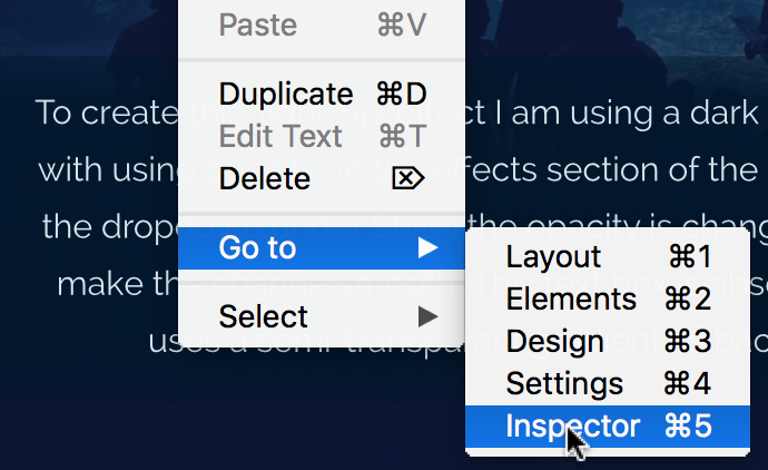
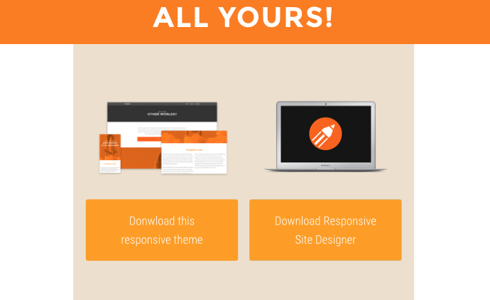
Absolute positioned elements also possess a secret power: they can be stretched. This can, for example, be used to create perfectly fitting overlays that change to a semi-transparent color on hover.

In the example above an absolute positioned container with button is used as overlay. Using zero values for all four offsets ‘snaps’ the container within the parent. On hover the transparancy is changed from 0 to 1 with transitopn effect. 

When the document body is the nearest positioned element providing the reference point, an absolute positioned element moves along when the page is scrolled.

Placeholder Picture
3. Pin it down!

An element with position: fixed uses the viewport as its coordinate system. This means it always stays at the exact same position, also when the page is scrolled. 

The same top, right, bottom, and left offset properties are used to place the element.

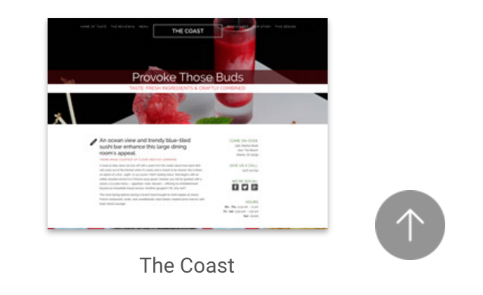
A navigation bar or header is sometime positioned fixed to keep it in view, even when the page is scrolled. Another example is a button or icon that links back the top of the page or some other important page section.

All these controls are really powerful but there’s one thing to keep in mind. In the world of endless screen widths where content naturally flows down, they should be used with care.